
How to Customise the Design of your Store
StoreConnect gives you the ability to customise its default user interface i.e. customise the design of your user-facing html pages with markdown, HTML, CSS, and Javascript.
While this affords you a lot of flexibility, there are a few important considerations to make that will ensure your store is easy to maintain and can accommodate and benefit from new StoreConnect features, bug fixes, and version upgrades without conflicting with your custom code.
There are three ways to customise the design of your store:
-
Add Content Blocks1 to our dedicated Custom Content Areas, which allow you to build custom layouts with our collection of predefined Content Block Templates and Liquid Helpers or bespoke markdown and HTML.
-
Add custom CSS2 to your store’s dedicated Custom Styles field or using Style Blocks on your store.
-
Add custom JS to our dedicated Head Content field field on your store.
Design Aesthetics vs. Structural Layout
StoreConnect gives you complete control to customise the aesthetic layer of your store but has some limitations when it comes to re-arranging the layout of existing design patterns, and where you can insert custom layouts created with Content Blocks.
Content Blocks are what give you the ability to control and create custom HTML but they cannot be inserted anywhere, and this is intentional. At StoreConnect we understand that user experience design can be critical to the success of an e-commerce business. To us, “time well spent” means not reinventing the wheel and using a research-based approach to deliver the best user experience in the simplest way possible.
Our design team relies on over 70,000 hours of research from Baymard’s comprehensive e-commerce dossier to inform our design decisions for common patterns that are known to cause usability issues, and ultimately have a detrimental effect on sales and retention.
The limitations we put in place allow you to focus on representing your brand’s unique identity and fulfilling your content needs, without having to worry about introducing potentially maladaptive design patterns or handling the complexity of things like optimizing for multiple screen sizes, devices, and browsers.
1. Content Blocks & Custom Content Areas
To help you understand what’s possible with customization we’ve categorised the areas of StoreConnect’s user interface into two groups.
-
Custom Content Areas are special designated areas in the UI that allow for more extensive and flexible customization. These areas are typically optional and empty by default and accommodate completely custom layouts through the use of our predefined Content Block Templates, markdown, or bespoke HTML.
-
Fixed Content Areas are, as the name suggests, fixed sections of the UI that don’t allow re-arrangement, removal, or additions to their underlying HTML structure. However, like Custom Content Areas, these areas can be fully customised with CSS to fit your brand needs.
To understand the difference between the aesthetic layer and structural layer (or layout) of your store it may be helpful to think of this in terms of building a house.
Fixed Content Areas do not allow you to adjust the architectural blueprint (e.g. the foundation, walls, and plumbing) but you have a great deal of control over what the house is going to look like. On the other hand, Custom Content Areas are more like building a house from the ground up - with the help of our templates if you desire.
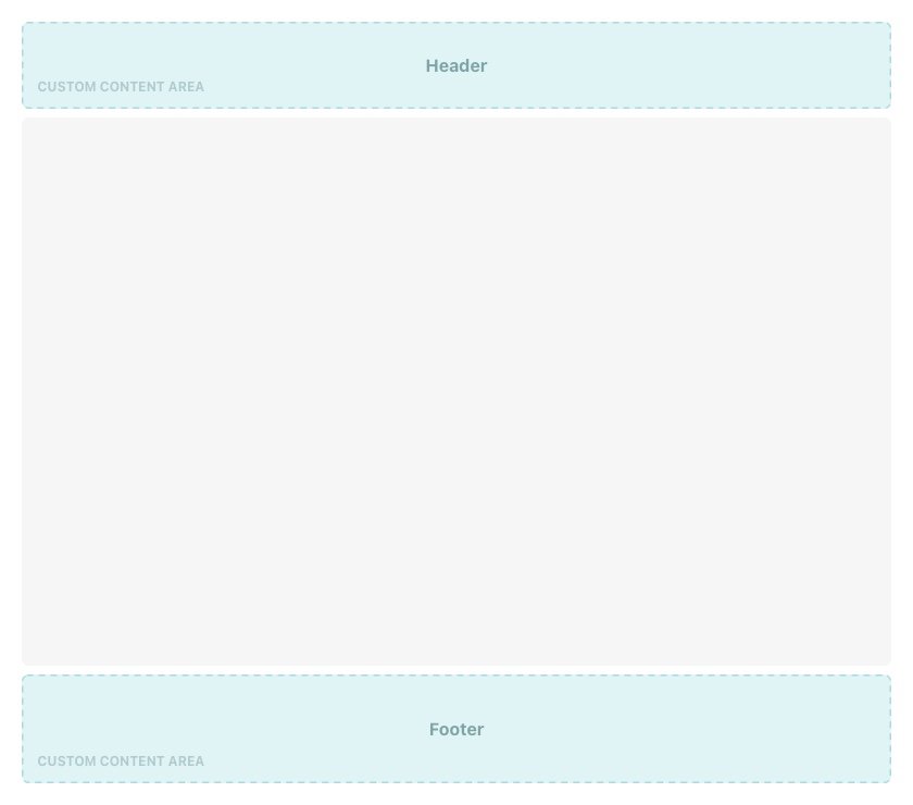
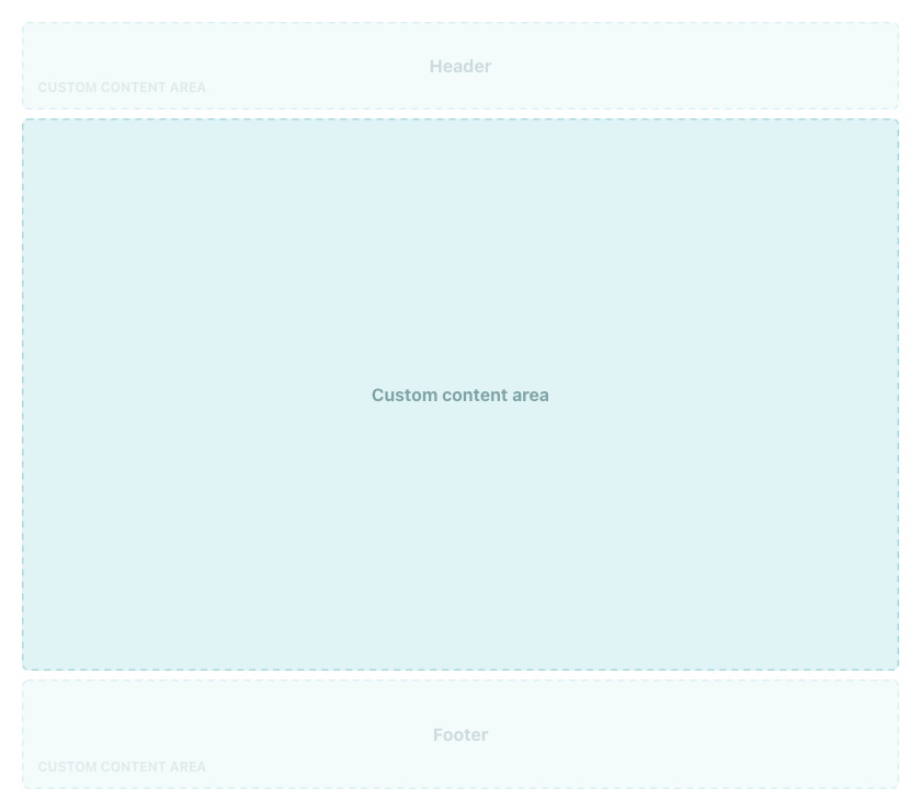
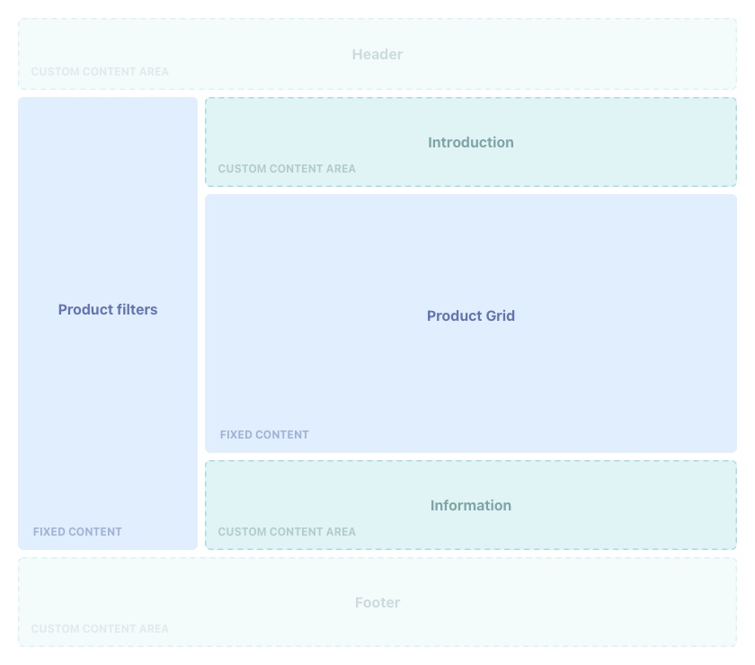
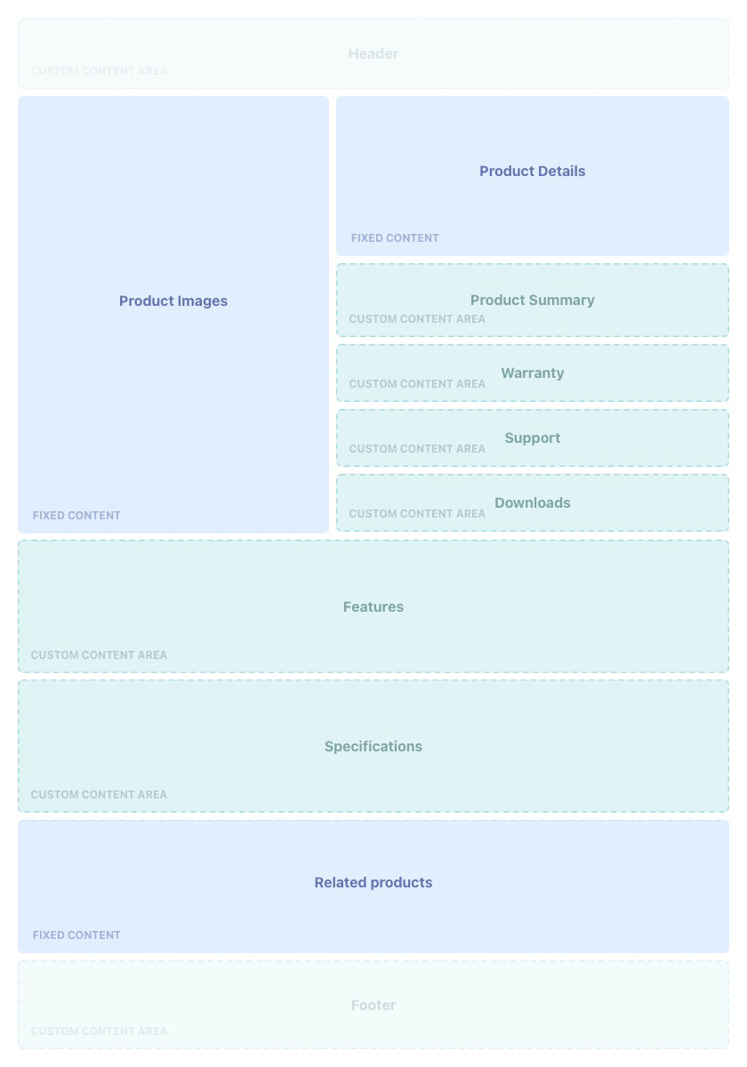
The following section shows a simplified view of StoreConnect pages and highlights which areas are Custom Content Areas, and which are Fixed Content Areas.
Header
Navigation is critical to the user experience and success of your store, but your Store’s global header and footer are also an important branding tool and we understand that one size doesn’t fit all.
Our default header layout with proprietary Custom Menu Builder will suit most businesses’ needs, but we also provide the ability to start from scratch and completely customise the layout, style, and functionality of these components with HTML, CSS, and Javascript. You can learn more in our Custom Header documentation.
Custom pages
Custom pages (this includes your home page) are a completely blank slate and fully customizable using our predefined Content Block Templates, markdown, and/or custom HTML, CSS, and Javascript.
Category pages
CSS can be used to customise the look and feel of category pages. In addition, we also provide two Custom Content Areas on these pages, which provide greater flexibility in these specific areas.
Custom CSS alone provides a lot of flexibility to Fixed Content Areas. For example, the ability to change the size and treatment of product cards, the number of cards per row, etc.
Product pages
Like category pages, CSS can be used to customise the style and (to some degree) the layout of product pages. It’s important to know that product pages are complex and have a number of layout configurations depending on the type of product; e.g. bundled products, bookings, products with variants, etc. It’s important to keep this in mind when approaching customisation.
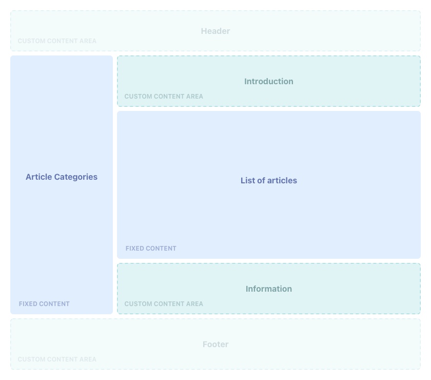
Article index page
CSS can be used to customise the look and feel of the article index pages. Like category pages, we also provide two Custom Content Areas on this pages, which provide greater flexibility in these specific areas.
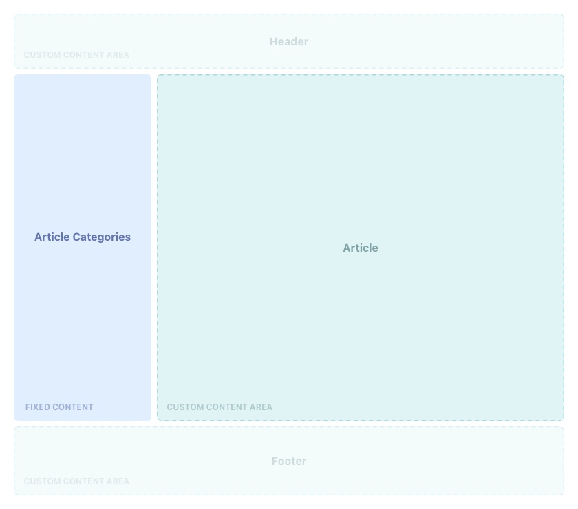
Article pages
The contents of articles are completely customisable with markdown, HTML, CSS, and content blocks. The sidebar, which is visible only when articles are categorised, is fixed but customisable through the use of CSS.
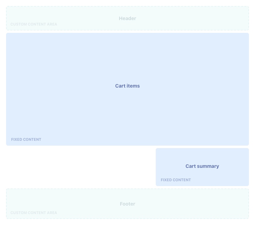
Cart page
The cart pages does not have Custom Content Areas and its design can only be customised with CSS.
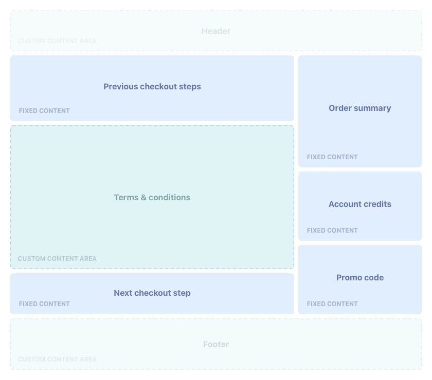
Checkout flow
Shipping
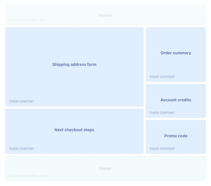
Delivery
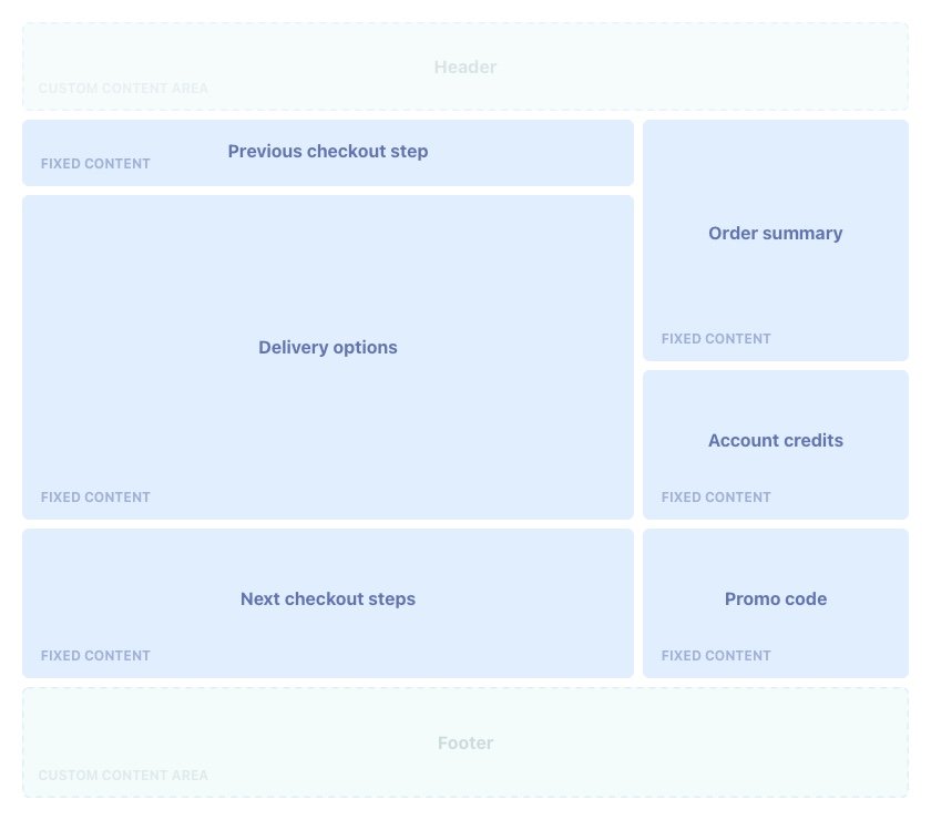
Terms
2. Custom CSS
Markdown and HTML can be used to control the layout and content of your store, while CSS is primarily responsible for the aesthetic layer; i.e. size, spacing, color, typography, borders, shadows, etc. If you’re familiar with CSS you will know this language does allow some ability to arrange, align, and order content, but will not allow you to re-arrange the underlying structure of the HTML. This is a limitation of the language rather than a limitation of StoreConnect.
There are two ways to customise the CSS on your store.
- Setting a value for predefined CSS Custom Properties (variables)
- Using a CSS selector to set a number of display properties on a piece of UI.
In both cases, this customization will take place in the Custom Styles field of your store.
CSS Custom Properties (variables)
The most straightforward, predictable, and fastest way to customise the design of your store is to make use of the CSS Custom Properties we define. These are global properties that are used throughout your Store’s UI. They have a single value with a default that can be overridden.
The following is a list of all global properties we currently define and use in StoreConnect:
:root {
  --sc-color-primary
  --sc-color-secondary
  --sc-color-error
  --sc-color-sale

  --sc-font-family
  --sc-font-size-tiny
  --sc-font-size-small
  --sc-font-size-base
  --sc-font-size-medium
  --sc-font-size-large
  --sc-font-size-xlarge
  --sc-font-size-xxlarge
  --sc-font-size-huge
  --sc-font-size-gigantic

  --sc-font-weight-normal
  --sc-font-weight-bold

  --sc-shade-darkest
  --sc-shade-dark
  --sc-shade-neutral
  --sc-shade-light
  --sc-shade-lighter
  --sc-shade-lightest

  --sc-spacing-micro
  --sc-spacing-tiny
  --sc-spacing-small
  --sc-spacing-medium
  --sc-spacing-base
  --sc-spacing-large
  --sc-spacing-xlarge
  --sc-spacing-xxlarge
  --sc-spacing-xxxlarge
  --sc-spacing-huge
}
To override a custom property globally across your store you can define them on the :root selector in the “Custom Styles” field associated with your store. For example, the following ruleset would override the base font size (i.e. the default font-size for all paragraph text on your store) to be 18px instead of StoreConnect’s default of 16px.
:root {
   --sc-font-size-base: 18px;
}
Customise Colors
Call to action buttons and background colours, such as for the footer and notice banners, use the primary and secondary colours by default. You can update these in the Store’s Custom Styles field.
You’ll need to provide HSL values separately. Let’s say your primary colour is blue and your secondary is green, you would provide the following values:
:root {
  --sc-color-primary-h: 208
  --sc-color-primary-s: 100%
  --sc-color-primary-l: 43%

  --sc-color-secondary-h: 127
  --sc-color-secondary-s: 63%
  --sc-color-secondary-l: 49%
}
Recommendation: To get the HSL values use the Hex to HSL converter.
CSS Selectors
While we encourage customisation through the use of CSS Custom Properties first, they have some obvious limitations. For more control over your Store’s design, you’ll want to target a piece of UI using an identifier (typically an ID we’ve allocated to it) and define a set of properties that dictate how that piece should be displayed.
StoreConnect provides a collection of selectors for use with CSS, but you can also create custom identifiers for Content Blocks you have created using the “identifier” field in Salesforce. You can use the “identifier” field in Salesforce to attach custom IDs to the Content Blocks you have created. These IDs can then be used to apply custom CSS styles. StoreConnect selectors are prefixed with “SC” and there are few different types that you should be aware of. These are:
ID Selectors
ID selectors represent unique pieces of UI that occur only once on any given page.
Class Selectors
Unlike IDs, class selectors can and are often used multiple times on a single page to represent common patterns across the UI. This can be something of a double-edged sword when it comes to customisation. On one hand, it allows you to make changes to common elements in one place. On the other hand, it means you have to be aware that a change you make in one place could have implications on another page.
3. Custom Javascript
You might want to use custom javascript for design reasons (such as animations and transitions) or to support a custom header or custom HTML used in Content Blocks.
When you create a new Content Block, it has an Identifier field. The value of this field will be used to create classes and data attributes that can be used as Javascript selectors for that Content Block.
Most custom Javascript should be included in the Head Content field associated with your store. You can visit Adding Custom Javascript, CSS, Body and Head Content Scripts for more information.
-
Content Block: Content Blocks are used to place content on your Pages and Articles. There are two types of Content Blocks 1) A Container Content Block, and 2) A Template Content Block. ↩
-
CSS: Cascading Style Sheets (CSS) is a programming language that defines the design styles; colours, font-sizes, font-types, border-colours, etc on a website. ↩
Back to Documentation