
Menu Builder
Your site navigation becomes even more powerful and flexible when using the StoreConnect Menu Builder.
To create a custom menu, you create a single Menu record and a Menu Item record for each navigation item. The Menu Builder gives you powerful options to build custom menus that include dropdown menus and mega menus (menus that include images).
The menu builder is not limited to custom menus for headers and footers; you can create additional menus to use within custom containers or pages.
Note: At this point in time, there is no ability to preview your menu within Salesforce.
If you want to preview the menu, our recommended way is to create a test store and assign your menu to it while you are testing.
Ways to Customise your Header
StoreConnect allows you to customize your store header in 3 ways.
-
Using the default menu which allows you to only adjust which product categories are shown in the navigation bar. How to do this is detailed in our Navigation Product Categories help article.
-
Using the menu builder with the default header by StoreConnect, it includes your logo, a search bar, login and account login (depending if the customer is logged in or not) and the cart item. You can customise what appears in the navigation menu using our Menu Builder. This article shows you how to do this.
-
Create a custom header using HTML and you will use liquid to render your custom menu. This option provides excellent flexibility for advanced or complex header designs. Here’s our HTML and Liquid header boilerplate that you can customise: Custom Header help article.
How to create a custom header menu
When you create and associate a custom menu as a header menu, it will replace the default menu created with your Navigation Product Categories and will be shown in this area of the default header.

To create a custom menu follow these instructions:
Step 1: Create a Menu with the identifier header and the style class name1 dropdown.

Step 2: Create Menu Items
-
From your Menu record, select “Related” and find “Menu Item”
-
Click on New, this will bring up a new window.
-
In the new window, fill in the information fields “Name”, “Display Name”, “Identifier” and “Menu”. (These are required in order to display menu items within the menu header).
If a Menu Item has a child you’ll need to add the style class namedropdownormegato display them as desired.
The “Menu Item Image” is entirely optional. It will display an icon-size image on the left side of the menu item.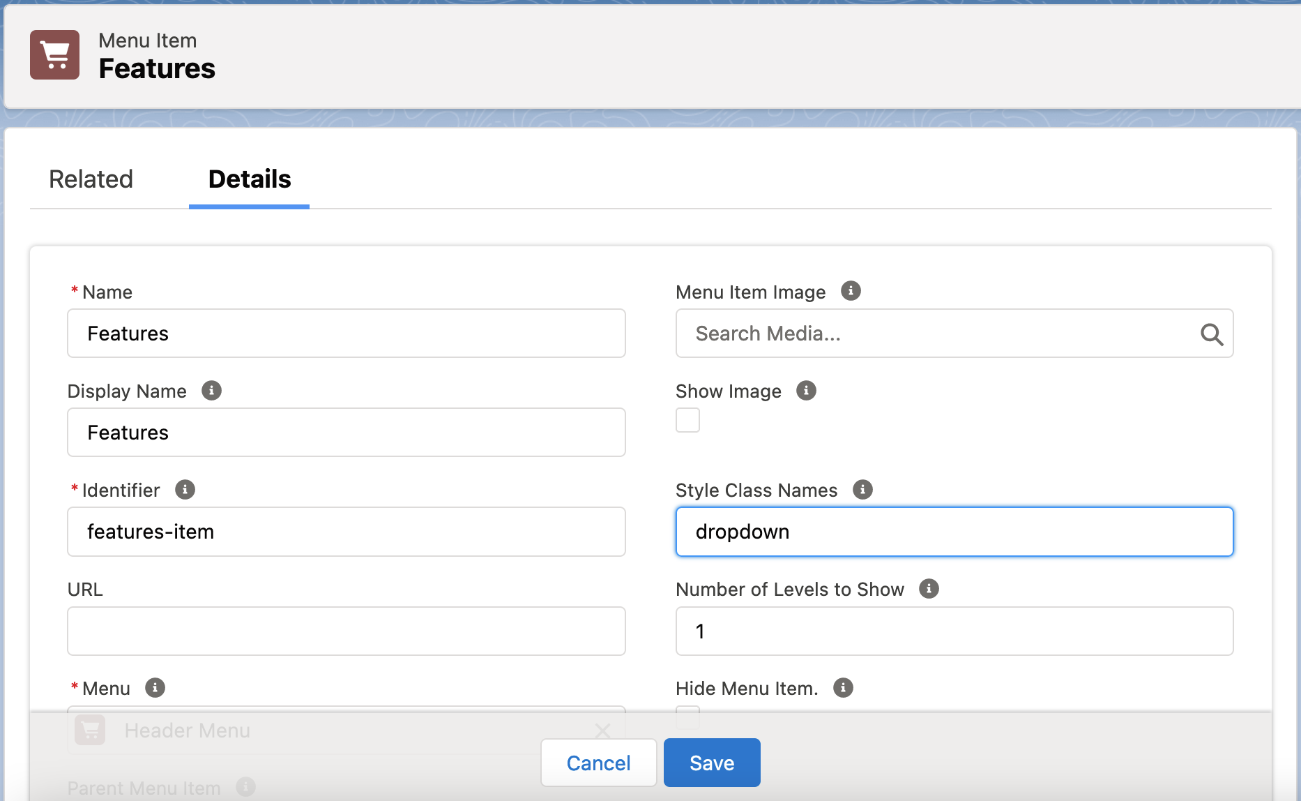
{: .img-border }
-
Select one Target type for where the menu item will navigate to. If you choose an article category, product category or page, any child of that category can be automatically shown from a dropdown if the dropdown or mega class is added to the Style Class Name field.
For example, choosing a product category such as Cars will show Cars in the menu, and if the dropdown class is entered as the “Style Class Name” of that menu item, it will show a dropdown list of all the related products within Cars.
Choose the URL field if you want to send the user to a custom URL or site. -
If you want to add child menu items to the item you just created, click on the related tab and then click on new. Repeat steps 1 - 4 to create as many items as you want.
Note: The Menu Builder supports up to three tiers of menu items.
Only use the style class name from the top menu item. Using thedropdownormegaclass from the second tier and down will prevent your child items from displaying.
Step 3: Associate your header menu to your store following these sub steps:
- Go to your store settings
- Under the ‘Content Management (CMS)’ tab look for the Header Menu field
- Click on the pencil icon to the edit the field
- Search for your header menu using its identifier or name
- Select your header menu
- Click on ‘Save’ and you will see your changes shortly on your site

Once the above is done, your site will now display the selected menu.
Optional: How to use your menu in a Custom Header
If you have chosen to build a completely custom header, then it is also advantageous to use a Menu object within it, this allows non technical users within your Salesforce org to edit the menu without having to edit the HTML of the custom menu you built.
Assuming you are using our recommended HTML markup on the custom header article you will need to insert your menu as follows:
  <nav class="SC-Navbar">
    <div class="Navbar_inner"> {{ 'header' | menu }} </div>
  </nav>
If you are using StoreConnect 10.5.0 and up use:
  <nav class="SC-Navbar">
    <div class="Navbar_inner"> {{ all_menus["header"].render }} </div>
  </nav>
You can also use the liquid tag to insert your header menu on any HTML markup of your own creation and with your own CSS classes. This method does not require using the standard header identifier, as the liquid code will look for the identifier you provide within the liquid code.
Responsive Menu and Trigger Button
It’s important to know that if you use a custom header with a button to display the menu on handheld devices, you must provide the correct identifier to the button element.
Here’s an example - Our standard hamburger button uses the data-menu-init attribute, and we provide the identifier (in this case header) as the value:
<button data-menu-init="header" type="button">
The example above will trigger a responsive menu on hanheld devices (excepting tablets) containing the header identifier.
If you are using another identifier just replace header with your identifier.
How to Create a Custom Footer Menu
This allows non technical users within your Salesforce org to edit the footer menu without having to edit the HTML.
Step 1: Create a Menu with an identifier of your choice (e.g. footer) and add your desired Menu Items as described above (How to create your header menu step 2).
Step 2: Go to your store settings and under the ‘Content Management (CMS)’ tab you will find the “Footer Menu” field.
Step 3: Click on the pencil icon to edit the field.
Step 4: Search for your menu by typing its name or identifier and select it.
Step 5: Click ‘Save’ and you will be able to see your footer menu shortly on your store.
Note: Don’t use the
dropdownclass on your footer menu as it will hide your items on handheld devices.

Optional: How to use your menu in a Custom Footer
If you have chosen to build a completely custom footer, then you will need to use liquid to render the menu. You can modify it dynamically without resorting to change the HTML every time you want to update the menu or navigation items.
Locate the section you want to embed the menu to and use the following liquid code where footer is the menu’s identifier:
{{ 'footer' | menu }}
If you are using StoreConnect 10.5.0 and up use:
{{ all_menus["footer"].render }}
Note: If you want your footer menu items vertically aligned then you need to add the
stackedclass to the “Style Class Names” field when configuring your footer menu.
Images
Use the show_image field to display a small thumbnail size image.
This feature is perfect for items with images within your header menu, custom social bars, or any type of custom menu where you would like to display a thumbnail within it.
General Information
Styling Customisation
Out-of-the-box classes and your custom classes can be added to the style_class_names field. Each class should be separated by a space. We’ve included a number of CSS classes that change the display of individual menus and menu items. These include:
dropdown
Can be used on Menus and Menu Items to display their children in a dropdown format.
mega
Can be used on Menu Items to display their children in a full-width mega menu.
wrap
Wraps columns so Menu Items without children are properly vertically aligned. Mostly used in mega menus.
subtle
Makes Menu Item links semi-transparent
end
Can be used on a Menu to align child Menu Items to the right/end of the block. Dropdowns inside this Menu are anchored from the right; the account menu is an example of this.
center
Menu Items are positioned in the centre.
space-between
Menu items will contain space between them and it expands the menu to 100% of its parent container.
space-around
Menu items will have space around them (i.e. before, between, and after) and it expands the menu to 100% of its parent container.
You can use your own classes if you need more customisations. We also provide some extra default CSS classes that will allow to customise your items on this article: “Default CSS Styles”.
To display Menu Items with images at the end of a Menu list apply the following CSS to a class name defined within the Custom Style field of the menu item:
.SC-Menu_item-image {order: 1;}
To ensure an image sits to the far right of a menu, apply the following CSS to a class name defined within the Custom Style field in the menu item for the preceding column:
#SC-MenuItem-[menu-identifier]-[menu-item-identifier] {flex-grow: 1}
(Note: Replace [menu-identifier] and [menu-item-identifier] with the appropriate values)
Native Child Categories, Articles, or Pages
Use the child_category_levels setting to show a menu item’s native children without needing to configure Menu Items manually. Any manually-configured Menu Items will be displayed after these native children. Remember to always use dropdown or mega within the Style Class Names field.
Dropdown Menus
- A Menu designed to contain dropdown menu items should include the style class
dropdown - A Menu Item should include the class
dropdownormegato display the Menu Item’s children appropriately
Including in other Content Blocks
You can embed menus within other content blocks automatically, for example, to build a social bar for your site driven by a footer menu, you could make a content block using the “No Added Styling” type with the following in the content section which would render the footer-menu followed by the sitemap-menu. You would then add this to the “Footer” field of your store record.
<footer class="SC-Footer">
  {{ "footer-menu" | menu }}
  {{ "sitemap-menu" | menu }}
</footer>
If you are using StoreConnect 10.5.0 and up use:
<footer class="SC-Footer">
  {{ all_menus["footer-menu"].render }}
  {{ all_menus["sitemap-menu"].render }}
</footer>
Troubleshooting
When updating your header and footer items, you may notice a delay in them updating on your site. These changes can take up to two minutes to come through.
If your menu is not showing up, we recommend checking if your menu has been assigned to the current store you are working on. If you are working with multiple stores at once, you should create a unique name for each menu to avoid confusion when assigning menus to every given store.
When you are creating multiple menus for one store, you notice that they disappear on handheld devices. The first thing to check is that the menu doesn’t contain the dropdown class. The dropdown or mega classes are primarily used on menus at the header level. However, we don’t discourage using it and play around with it in multiple scenarios.
Don’t hesitate to contact the support team if you encounter any issues.
-
Class Name: A Class Name is the name given to a template of software code predefining visual or functional behaviour. ↩
Back to Documentation