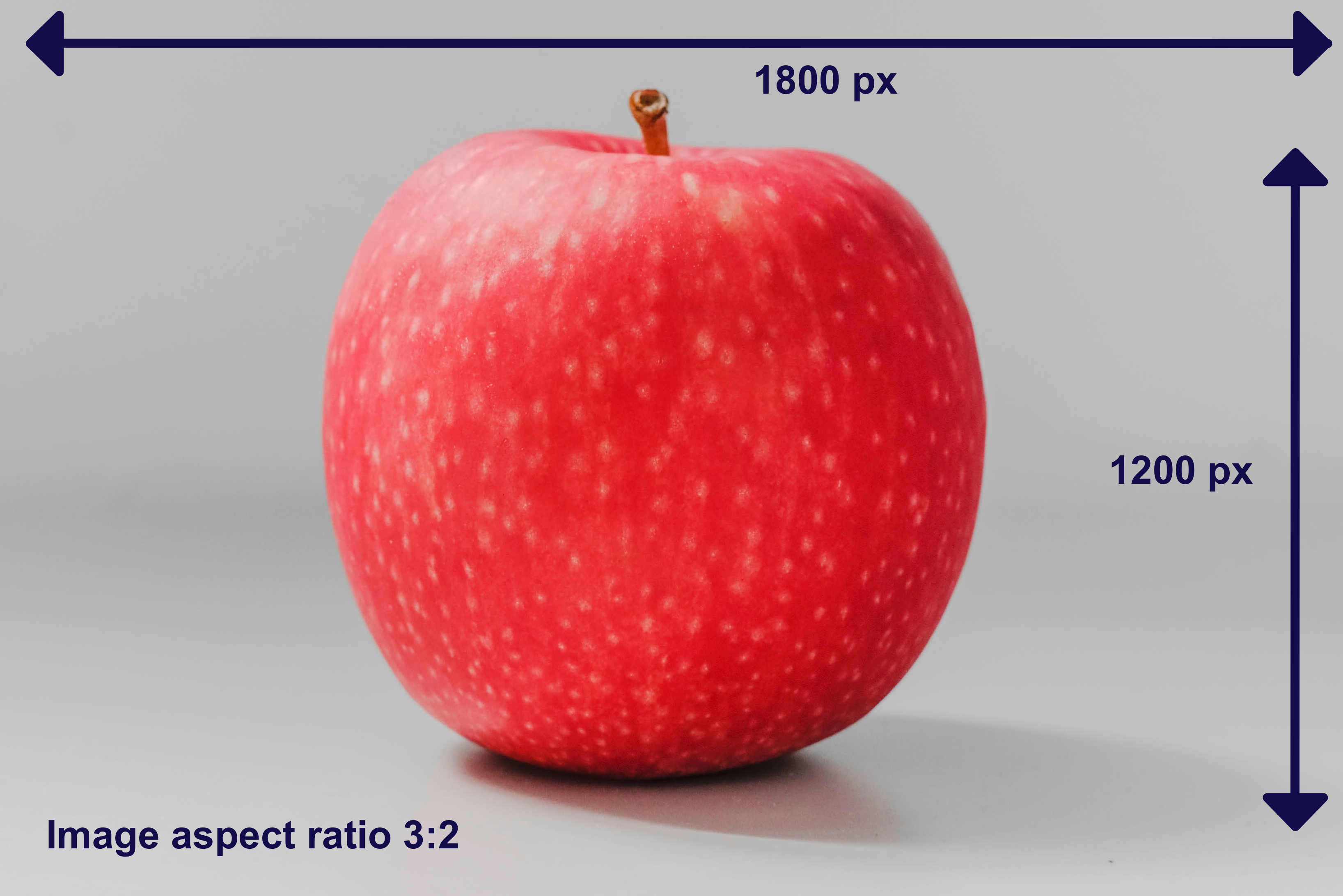
Aspect Ratios
A store could contain a mix of completely different product image sizes making it hard to keep consistency across all pages or content blocks.
Note: The aspect ratio is related to, but different to the image size, to resize an image (in terms of how many bytes it takes to download) see our article on how to insert the image via liquid and the section on Rendering Images in Various Sizes.
Our templates handle oversized images using liquid filters to render the different sizes but they don’t handle multiple aspect ratios on the same page.
The proportional relationship between height and width, in other words, aspect ratio, is key when uploading media and handling the situation mentioned above. It is commonly expressed as two numbers separated by a colon, as in 3:2.
There aren’t specific standards on how wide or high an image should be as this can vary from store to store but here are the recommended aspect ratios:
- 1:1 width and height are the same
- 2:3 portrait-style image, the height is 1.5 times longer than the width

Using a consistent aspect ratio for all the images of a particular type makes them display better side by side, because they all display as the same size. For example, if you want your product images to display as the same size within a collection, then they need to have the same aspect ratio.
We strongly recommend you keep the ratio consistent so your store pages display uniformly.
How to fix the aspect ratio using CSS
Sometimes, is not possible to upload all images with the same aspect ratios or same height and width. Product cards and category cards are most likely to be affected if you upload images with different aspect ratios. To prevent misalignment of headlines, descriptions and images you will need to implement the following CSS:
For product cards:
  .SC-ProductCard_image {
    aspect-ratio: 1/1;
  }
For category cards:
  .SC-ImageLink {
    aspect-ratio: 1/1;
  }
aspect-ratio: 1/1 will create a perfect square. You can change the numbers and play around with them. It’s important to consider that it won’t expand the image; it will just fix the proper distribution of elements with the product or category cards.
Learn more in this aspect-ratio doc by MDN.
Using the object-fit property
The object-fit property helps to avoid expanding the images, it will fit the image within the image box.
.SC-ProductCard_image {
  height: 100%;
}

.SC-ProductCard_image img,
.SC-ProductCard_image svg {
  object-fit: contain;
  height: 100%;
  aspect-ratio: 3/2;
}
Or using cover size to crop the image within the image box:
.SC-ProductCard_image img,
.SC-ProductCard_image svg {
  object-fit: cover;
  height: 100%;
  aspect-ratio: 3/2;
}
Additional notes
To calculate whether images have the same aspect ratio, divide the image’s width by its height, and then compare the results.
For example, an image that is 3000 px by 1500 px has an aspect ratio of 2:1 (3000 divided by 1500 equals 2) and an image of 1600 px by 800 px has the same aspect ratio of 2:1 (1600 divided by 800 equals 2).
Back to Documentation