Content Block Containers
A Container block can contain one or more child Content Blocks of any type. Containers are the foundation to great looking content as they help you to lay it out on your page; and by nesting Containers within Containers, you can achieve even more complex designs.
To add content blocks to your container:
- Use the ‘Child Content Blocks’ Related List and Click ‘New’.
- Search and Select the block you want to add
- Set the positioning of this block in relation to others in the same container
- Make sure the Usage Type is `Content’
- Click ‘Save’
Tip: When using Position, increment by 10. That way, if you decide to slip an extra block in-between two others later on, you will have room to do so without having to re-number all following blocks.
Configuring your Containers
There is no requirement to add a title or subtitle to your container. Once you have selected the Container template and given your container a name, you only need to decide on a Layout Style.
| Fields | Usage | Input |
|---|---|---|
| Layout Style | Defines how the container is laid out | Picklist |
| Title | H1 heading for block | Plain Text |
| Subtitle | Medium sized subtitle for block | Plain Text |
Layout Style Options:
| Layout Style | Example |
|---|---|
| No Layout Displays child blocks under each other in order. |
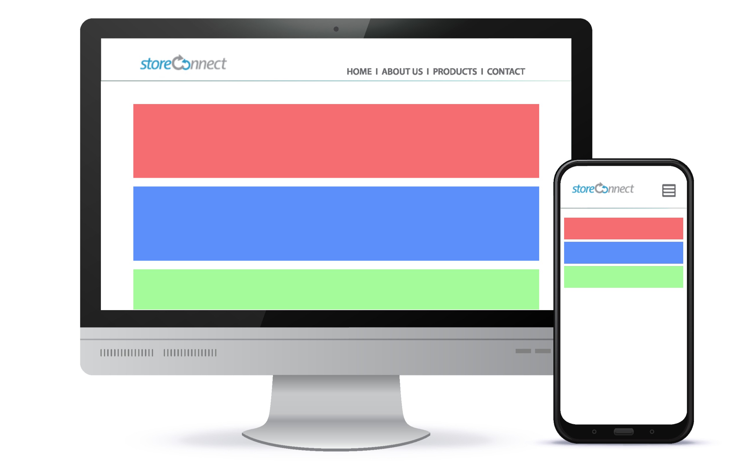 |
| Even distribution of all children no wrapping Displays child blocks evenly in a single row on all devices. |
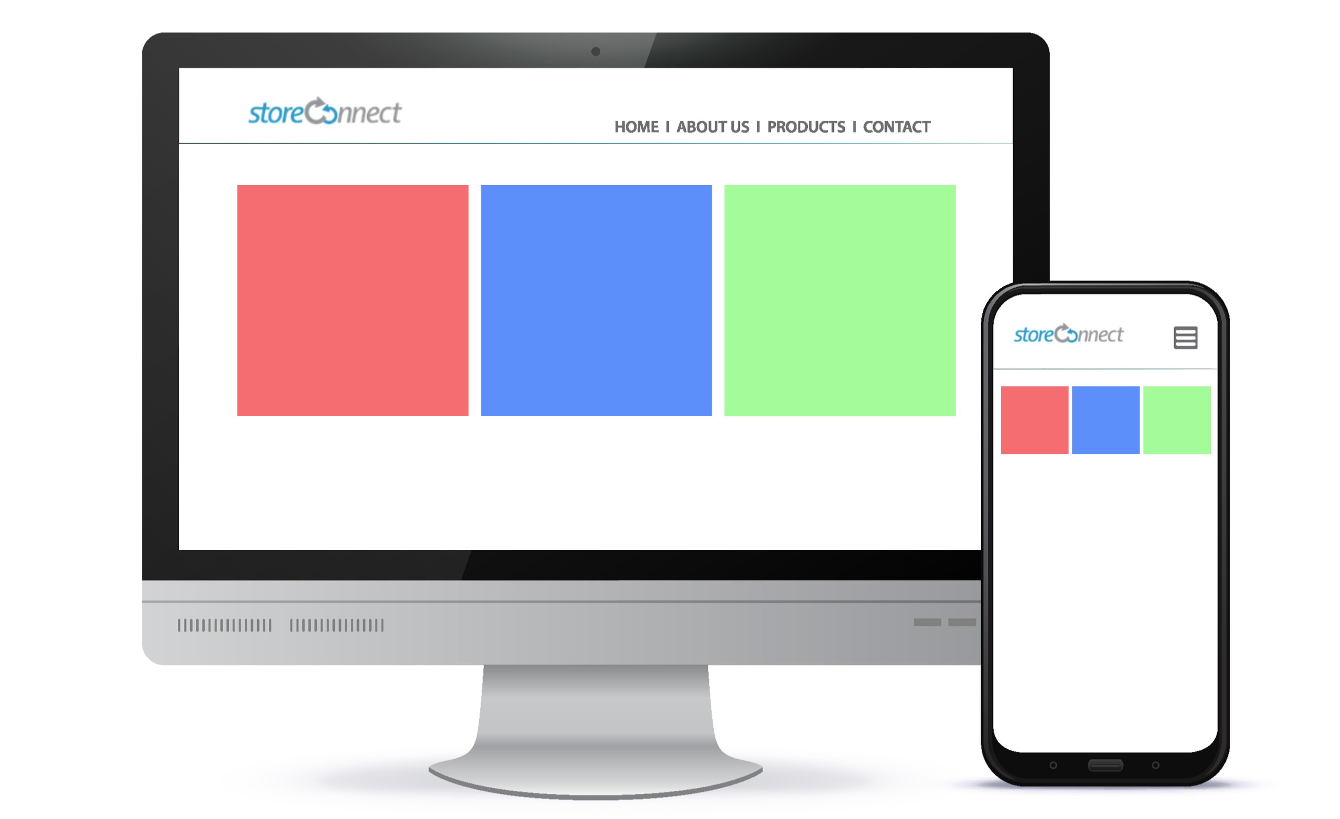 |
| One third left first child block, two thirds right second child block Displays two child blocks in two columns in the ratio of one third (first block) and two thirds (second block). On mobile these are stacked at the full width of the device. |
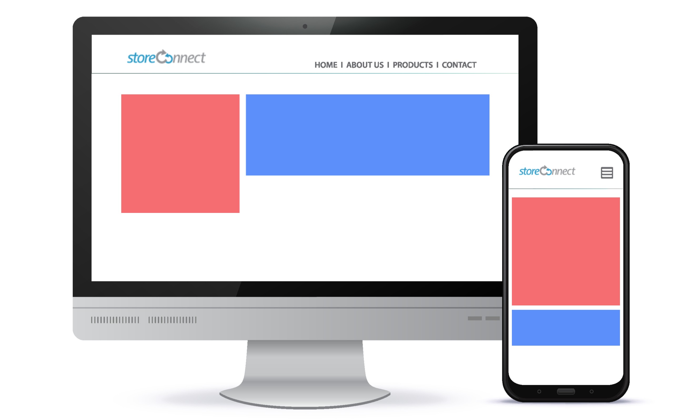 |
| Two thirds left first child block, one third right second child block Displays two child blocks in two columns in the ratio of two thirds (first block) and one third (second block). On mobile these are stacked at the full width of the device. |
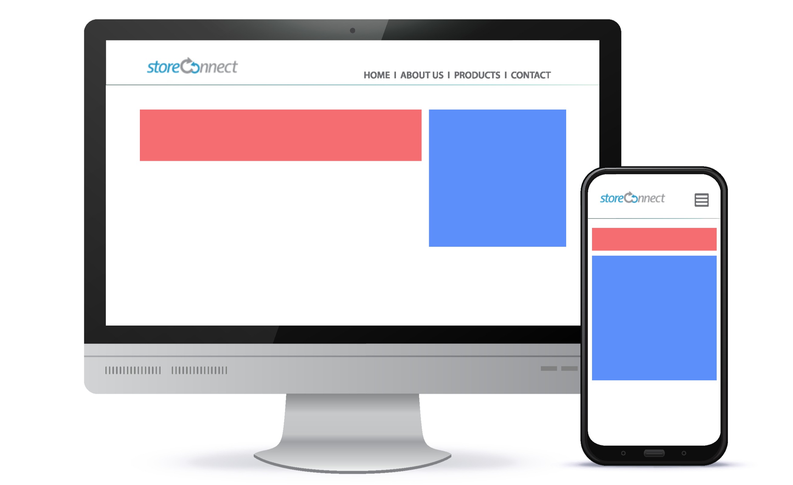 |
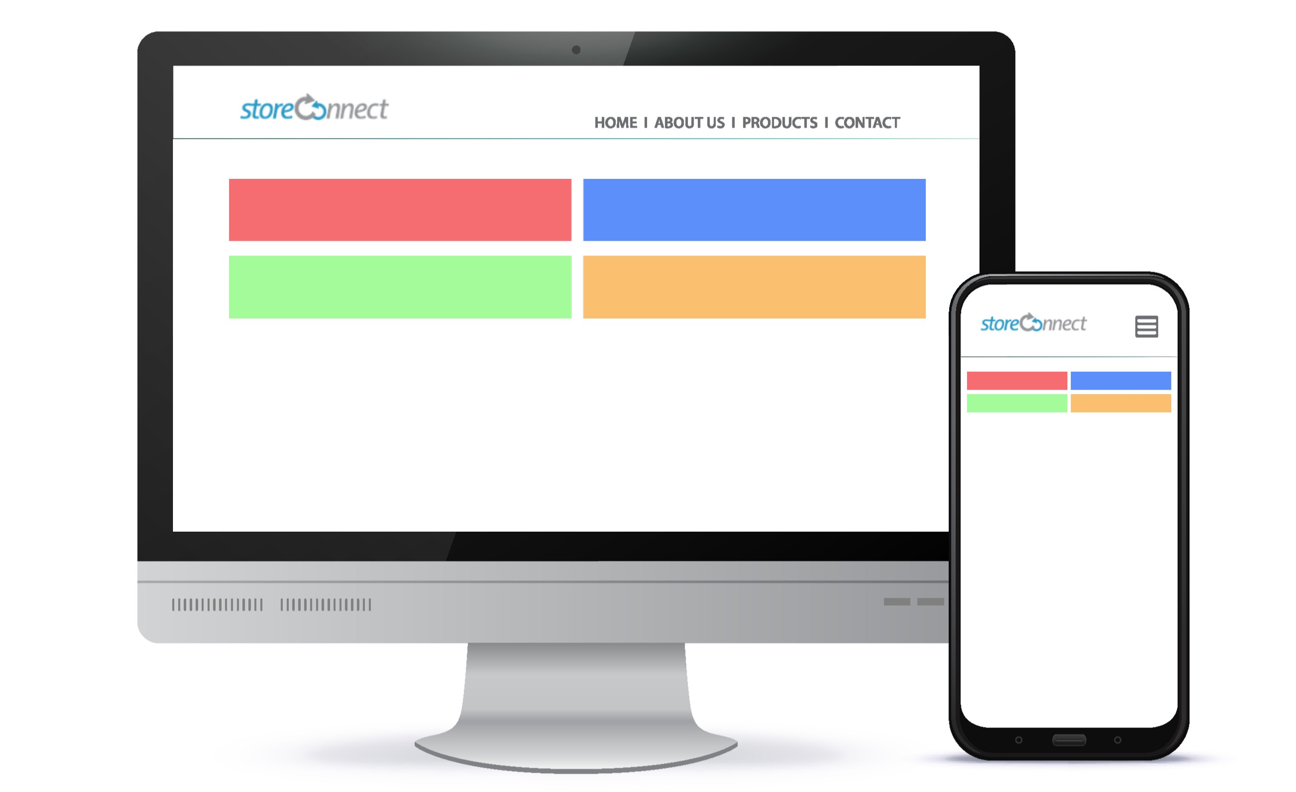
| Two columns, wraps child blocks to new line Displays child blocks in two columns on all devices. |
 |
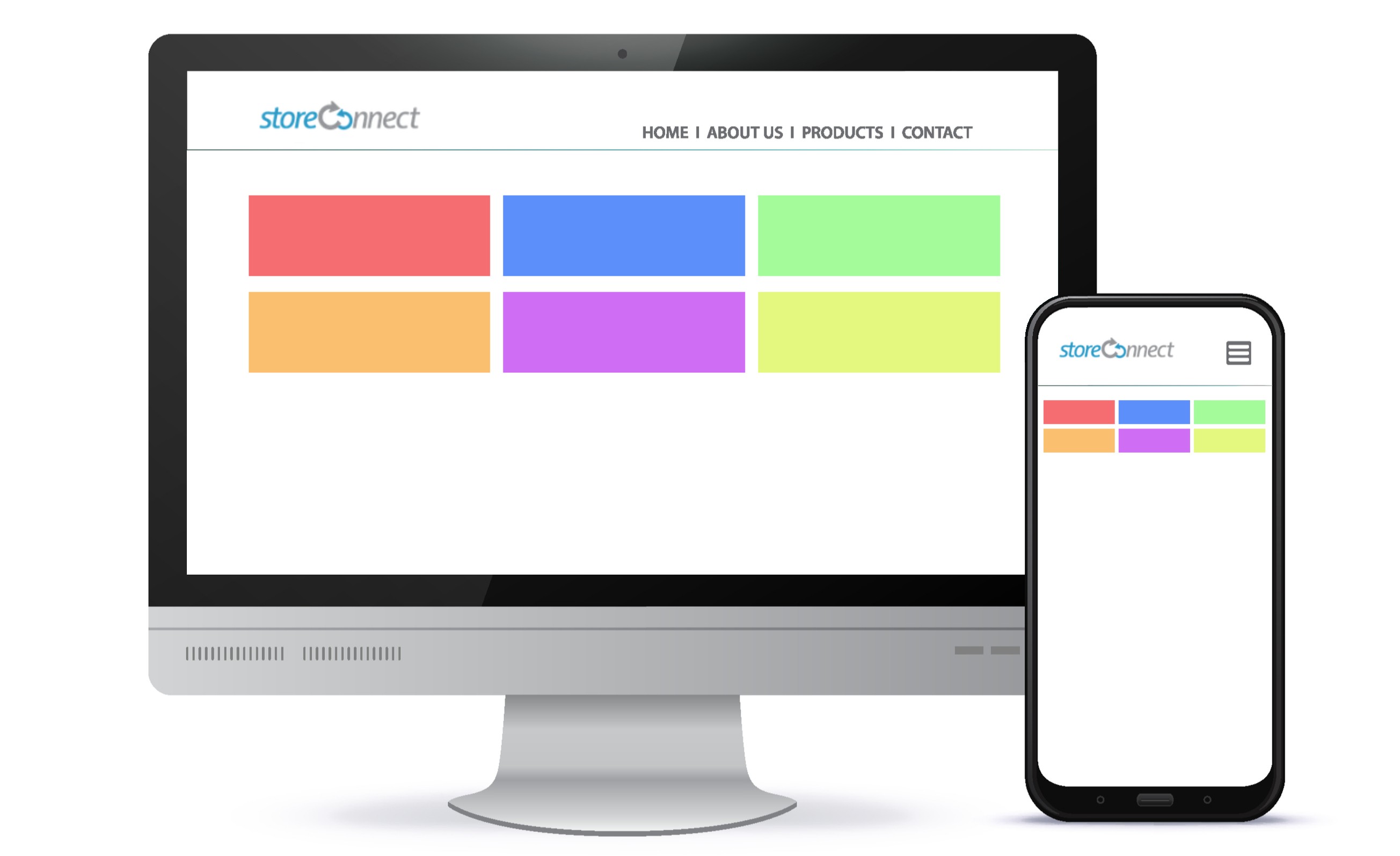
| Three columns, wraps child blocks to new line Displays child blocks in three columns on all devices. |
 |
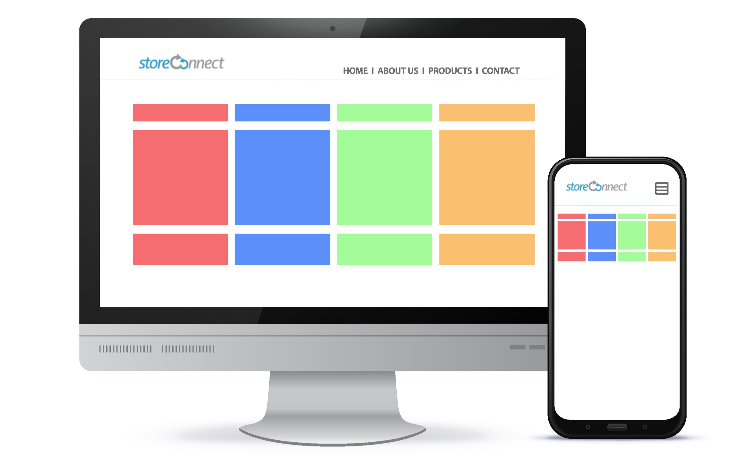
| Four columns, wraps child blocks to new line Displays child blocks in four columns on all devices. |
 |
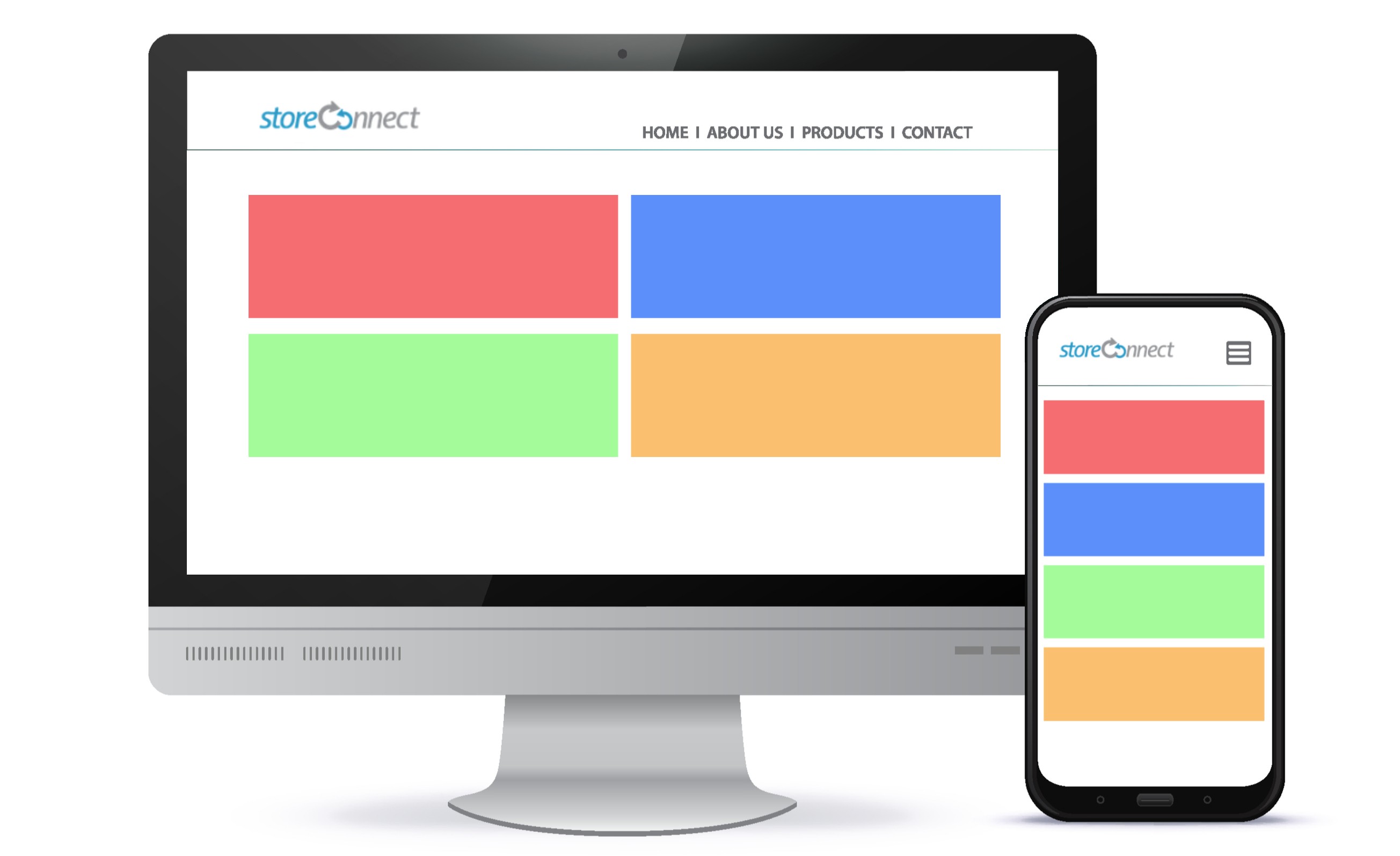
| Full width on smaller screens and two columns on larger Displays blocks in one column on small devices and two columns on larger devices. |
 |
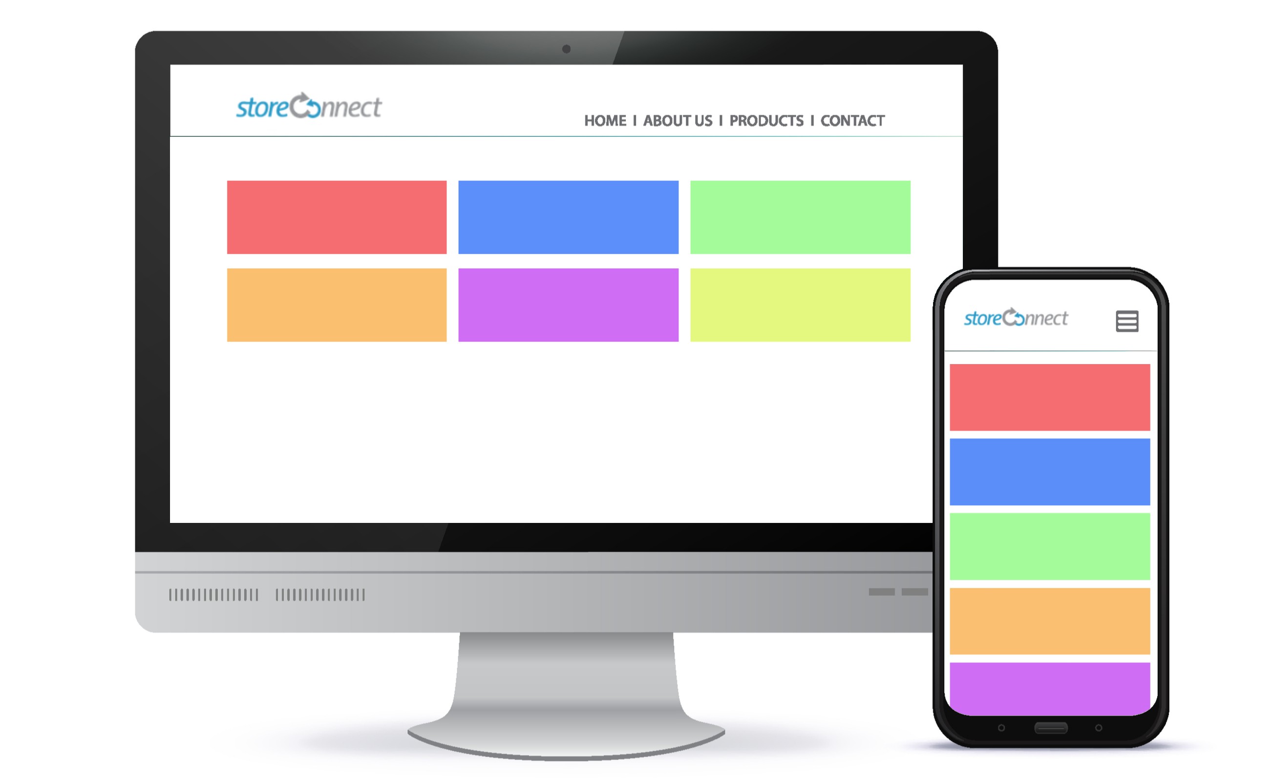
| Full width on smaller screens and three columns on larger Displays blocks in one column on small devices and three columns on larger devices. |
 |
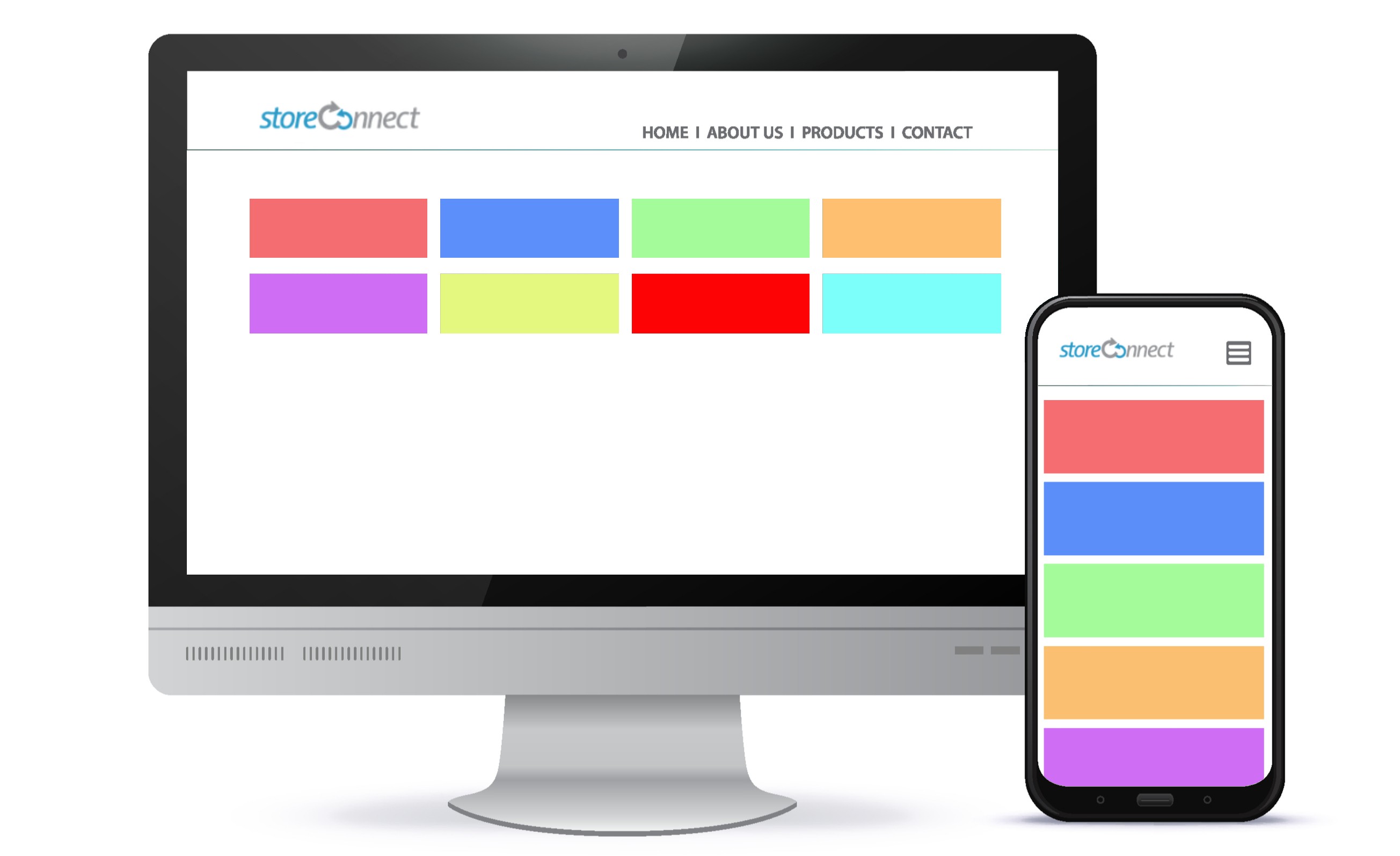
| Full width on smaller screens and four columns on larger Displays blocks in one column on small devices and four columns on larger devices. |
 |
Continue to learn how to create a great looking site with the other Content Block Templates.
Back to Documentation